How I Updated My Portfolio
So I’ve been talking a lot about this design portfolio re-do, but being new to blogging, I didn’t realize I need to tell you how I did it. So here’s the how-to. I use Cargo Collective, “…a personal publishing platform aimed at creating accessible tools and a networked context to enhance the exposure of talented individuals on the Internet.” I’m using the “Polaris” template, very spare and clean, much like this blog.
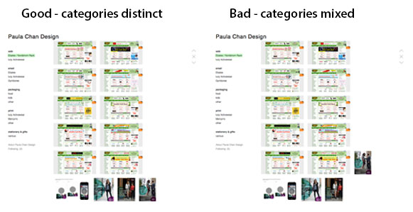
DID THEY UPGRADE THEMSELVES?
I mentioned my portfolio was formerly rather anemic. In my defense, I’ve actually had this portfolio site for about a year or so, and I could swear when I first started using it, it was much more limiting. You were only allowed to post very few things for free before you had to upgrade. So I only posted a few things, more than I thought was the limit, and thought I would just wait to see if they asked me to upgrade. They never did. Then when I went to update it last week, it now says I can have up to 12 “projects” and 100MB of image storage.
IT HELPS TO HAVE PHOTOSHOP
I wanted to add new samples of my web design work first and foremost, since the last ones I did were 2-3 years old. The first thing I did was create templates in Photoshop to drop each kind of media into so they would all be the same size. This keeps the flow from one sample to the next smooth so your images are not “jumping” all over because of size changes from one to the next.


For instance, I created a template for my email samples. I put all my emails into one Photoshop file, each one their own layer so I can click the layers on and off to check they are all the same size and all aligned, again, so clicking from one sample to the next is seamless. You can wait till all your samples are imported before saving them out, or one at a time. When ready, I then use the “save for web” function and choose png format for images with flat colors (i.e. logos) or jpg for images with gradient colors (i.e. photos). In each of these formats, you can choose the level of quality of the image, and see the size your finished image is going to be in the bottom left corner of the preview window.
For png’s, the fewer colors, the smaller the file size, but you will also see image quality go down in the preview window. I choose the level that’s acceptable to me and click save. For jpg’s, you can also use the level slider to find the best quality image with the smallest size. I only have 100MB of storage for free, so I’m going to find the balance between saving space and good quality images.
NOW WE’RE READY TO UPLOAD
The Polaris template I use automatically puts as many thumbnail images as will fit in a certain amount of space. So to keep the collections of my work together so it’s esthetically pleasing on the page was a challenge. Sometimes I had to make an image larger or add extra white space to “push” a thumbnail image down to the next row so it wouldn’t look stupid to have one sample of one collection hanging out in the same row as a different collection. I had to figure out the simple coding to move my images around as well. I don’t remember whether it originally gave me a template, but I was able to figure it out again quickly based on what I had done before and experimenting.
Apparently, with this template you can upload individual images where you scroll down the page to see them, or put them in a “slideshow.” When you upload an image it appears in the code section like this: {image1}.
It doesn’t matter if you have them all in a line: {image1}{image2}{image3}
or stacked:
{image1}
{image2}
{image3}
They show up on your page the same.
What does matter is if you put them into a slide show, then all the images stay in the same place on the page, but you have to click to see the next one.
The code looks like this:
{slideshow}
{image1}
{image2}
{image3}
{/slideshow}
Notice the forward slash in the closing slideshow “command” (or whatever it’s called–I’m not a coder, but I sorta know how to use it). I like to stack my code so it’s easier to “read” and figure out what’s going on. Total pain to format, but worth it.
LIMITATIONS MAKE YOU MORE RESOURCEFUL
The set up is very much like folders on a computer. The hierarchy is “sets”, then “projects.” Originally, I had four categories or “sets,” web, email, packaging and print, and had each client as their own “project.” Now with more clients and more samples, within one set, I consolidated some clients into one project but kept other clients with a lot of samples in their own project. For clients where I only had one or two pieces, I made an “other” project. This enabled me to create a new category of stationery & gifts to show off even more of my work.
For instance, I originally had the category (set) packaging with clients (projects) Williams-Sonoma, Discovery Channel, Cost Plus and Various. But I noticed that within these, I could generalize, and consolidated them under food, kids, and other. So now I had three projects instead of four, thus freeing up the unused project for my new category (set) of stationery & gifts with a project of “various.” You can’t have a set without a project in it. You can only upload images into a project. (If you are at all interested in creating your own Cargo site, this will make more sense when you try it yourself.)
TADA!
So much sweat (and some swearing) later, I have a site that is much more representative of my body of work. Check it out here: www.cargocollective.com/paulachandesign and let me know what you think in the comments! Thanks.
Ciao! Paula
December 13 @ 19:01
Hi Paula, is this site free? I am trying to decide if this will help organize my photography portfolio. Thanks!
December 13 @ 21:18
Hi Betty! YES it is free for 12 “projects” and up to 100MB file storage. So if you follow the instructions on my post to make your images as small but as of high quality as you can, you can put up quite a few photos. If you need help, with any Photoshop questions don’t hesitate to ask. I’m quite experienced, and I’ll help if I can.
December 17 @ 13:19
Hi Paula, Thanks for the tutorial. I’ll definitely take a better look once my son is out of school on break. =) Love your site!